The Logo
The blue shield should be used as the recommended spacing measure when placing the logo with other elements. The logotype must be reproduced with a clear area around it which is free from other graphic elements.
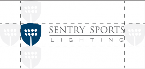
Standard Logo / showing x height
Standard Logo

Alternate Logos


Correct Logos
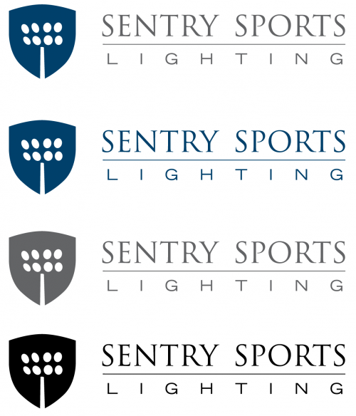
While the company’s logo is in blue and grey, you can use one color for the logo; either the branded blue, black or grey (60% black).
Incorrect Logos
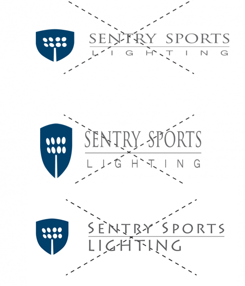
Do not stretch the logo.
Do not use other fonts for the company name.
The Colors
Blue is one of our greatest distinguishing features. It is an essential part of our brand identity. Combined with white, black and grey – a distinct style is created which is both simple to use and powerful through its simplicity.
CMYK: 100. 78.34.20
RGB: 0. 64. 107
HEX#: 00406b
PANTONE: 2955 C
CMYK: 0. 0. 0. 100
RGB: 0. 0. 0
HEX#: 000000
PANTONE: BLACK
CMYK: 60. 52. 51. 21
RGB:101. 101. 101
HEX#: 656565
PANTONE: Cool Gray 10 C
CMYK: 0. 0. 0. 0
RGB: 255. 255. 255
HEX#: FFFFFF
Typography / Brand Fonts
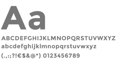
The Montserrat font has played an important part in building the brand. Montserrat comes in regular and bold.
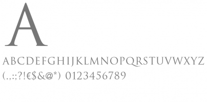
The trajan font is primarily used for the logo text. Only use this font for “SENTRYSPORTS”.
Note: Trajan only comes in capitals.
Montserrat
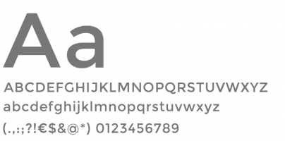
Montserrat Bold
Trajan
Exterior lighting for luminaire schedules, statistics, notes, lighting pole layout and fixture placement for Baseball Fields, Softball Fields, Soccer Fields, Football Fields and Tennis Courts.
